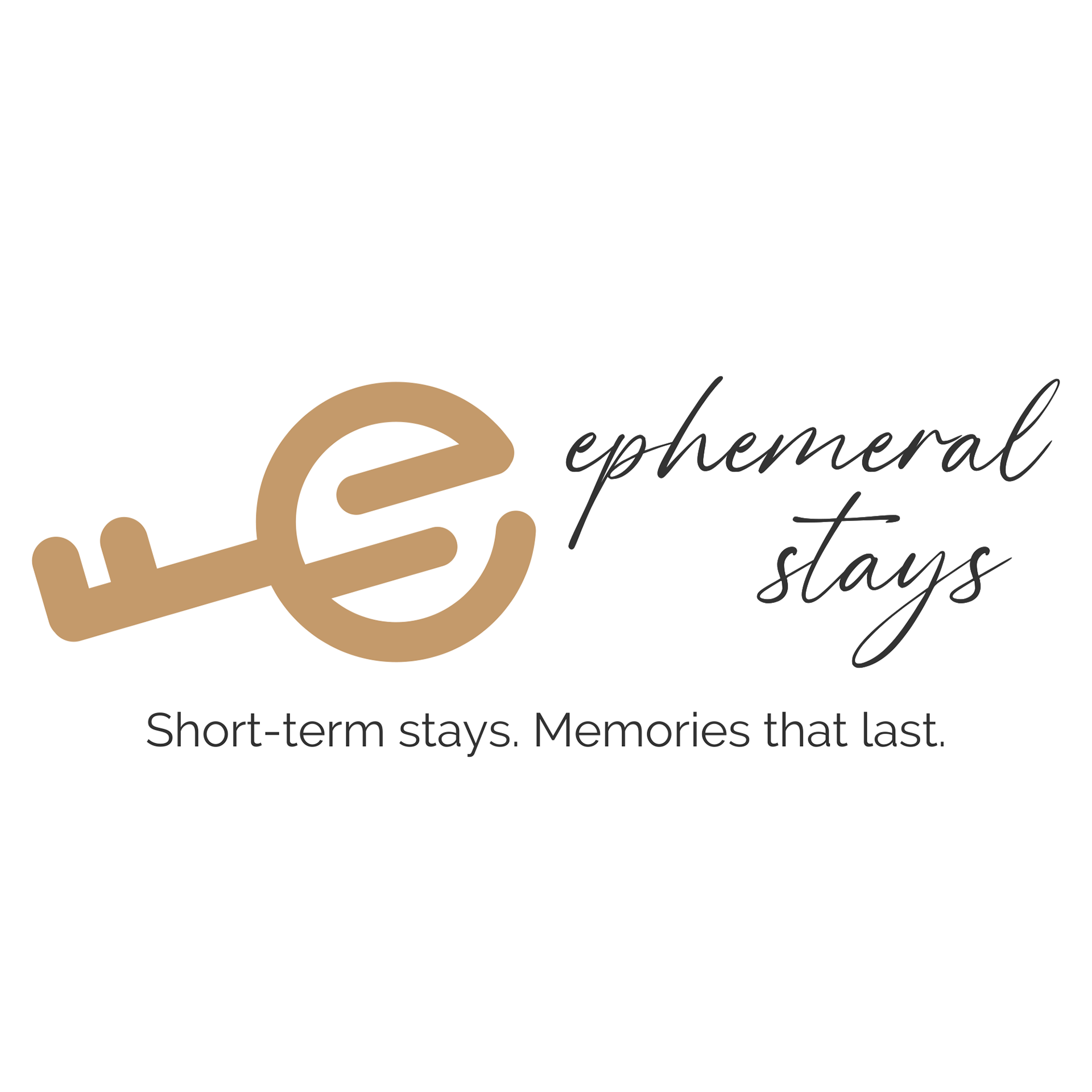
As the co-owner of Ephemeral Stays, I created the brand identity for our boutique short-term rental management company. The brand message was built on the idea that while stays may be brief—or ephemeral—the memories made should be lasting. “Stays” is also a subtle nod to the common STR industry term for a trip, creating a name that’s both meaningful and market-relevant.
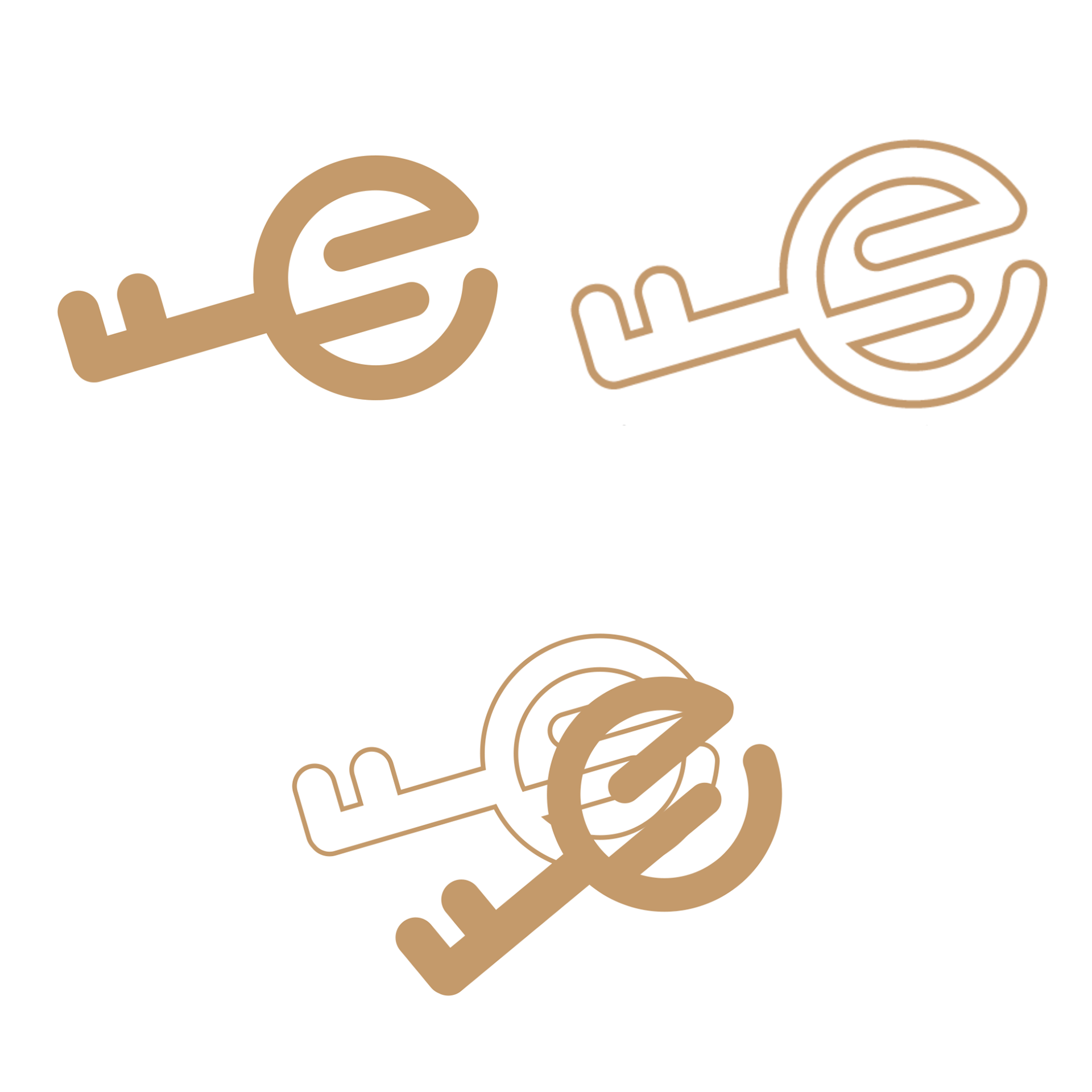
The logo features a custom key icon that forms both a lowercase “e” and a subtle “s” inside it—representing the initials of Ephemeral Stays. This visual symbolizes access, hospitality, and the fleeting-yet-meaningful nature of each guest experience. The elegant script wordmark paired with a clean, modern tagline strikes a balance between warmth and professionalism, aligning with the brand’s elevated yet welcoming tone.
The tagline—“Short-term stays. Memories that last.”—captures the heart of the company’s mission: to create meaningful, restorative experiences for every guest. This identity was applied across all guest-facing materials, digital platforms, and operations while I managed a portfolio of 19 homes under the brand from 2022–2024.